As an addendum to the post on the craft of logo design, we spotted the new Sonos logo this morning. It seemed interesting but perhaps a little complex … until we scrolled the page it was displayed on.The interaction with the refresh rate of the screen creates a deliberate pulsing effect that mimics sound waves emanating from the centre. You can either click this image and scroll this screen up and down or watch the video clip above (ideally in HD) to see it.
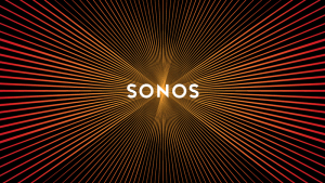
Of particular interest to us was that this is a piece of marketing collateral that has been natively designed specifically for the channel in which it’s most consumed. In print, the logo is nothing special but on screen it has people all over the world talking about it and has even begun trending on Twitter.While recreating this success is going to be a really tall order, we might want to consider taking the same native approach to all of our marketing and brand materials. Why for example should even something like a PDF price list that is often considered as almost perfunctory, be identically designed and applied everywhere?The audience experiences these items differently in print, online or at an exhibition so rather than just copy/pasting, perhaps each application is just another opportunity to do something interesting and stand out.